Scandium Typeface
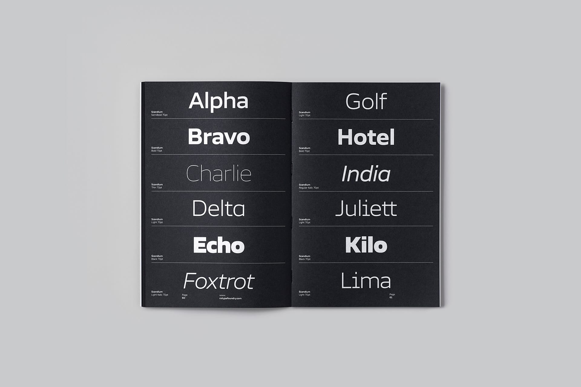
Scandium is a contemporary sans with open shapes and a technical vibe inspired by the needs of the automotive industry — openness, performance, and style. With its modestly squared curves, high x-height, and vertical terminals, Scandium marries performance with purpose.
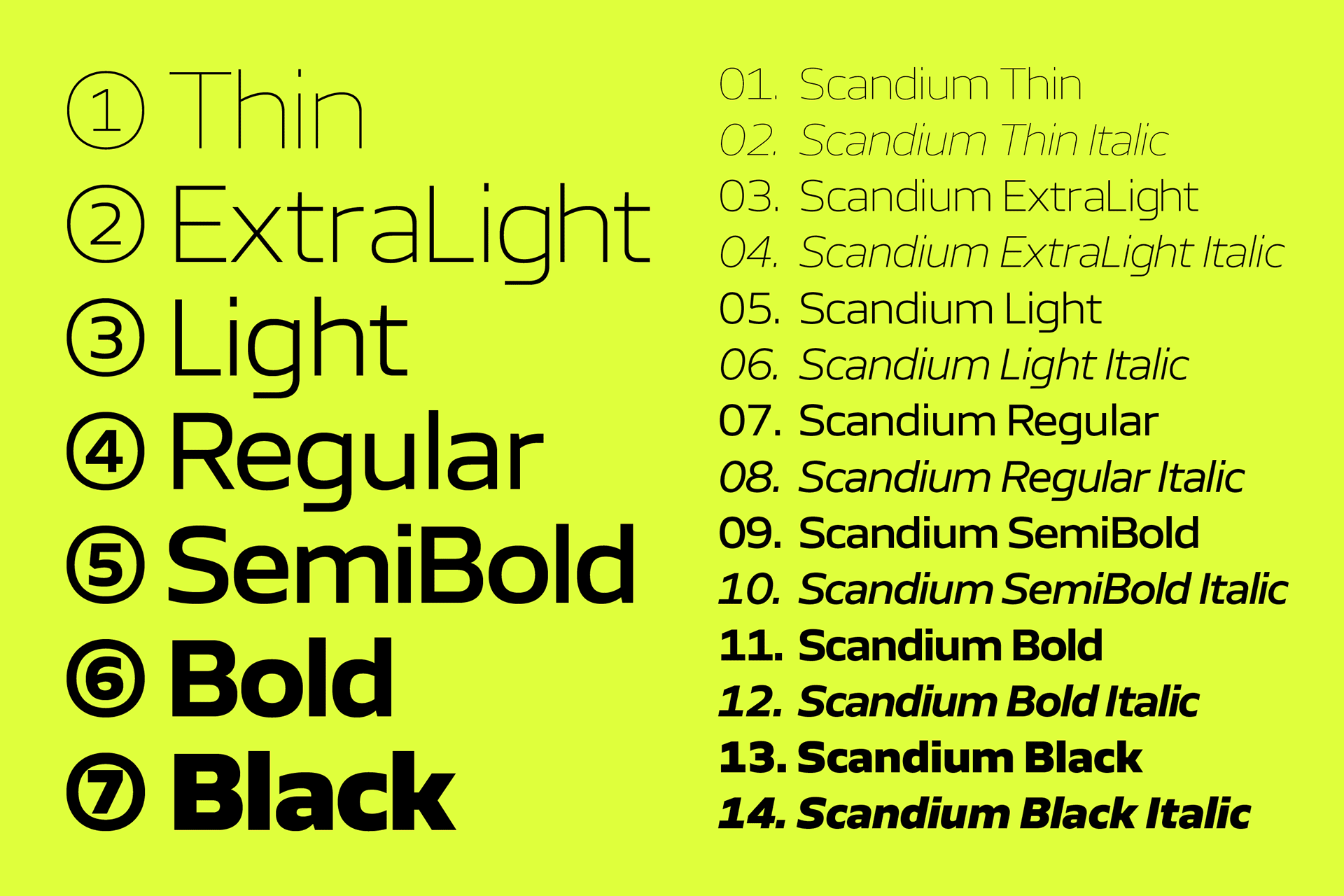
This type family seeks to fulfill the needs of designers looking to create a purposeful look for anything from automotive brands to space travel and aviation, even for luxury watches. Across all its 7 weights, from Thin to Black – Scandium looks self-assured and functional, without ever seeming bland or overly constructed. For those clients needing to comply with stricter accessibility norms, each weight includes alternate characters that are more recognizable (like I, l, i, and j with serifs).
The Scandium family includes a large set of icons, which relates back to the desire for it to be used within in-car entertainment systems. We created icons and symbols that can be used in multiple environments, from web UI (hamburger menu, checkout cart, user profile) to digital media players (play, pause, stop, shuffle), from electric vehicles (charging icon, battery, warning sign) to navigation systems (directional arrows, location pins). To top it off we included a fun set of emojis (smiley, heart and poo) that can inject some fun into any design.


Related projects
We use cookies to enhance your browsing experience. By continuing to use this website, you consent to the use of cookies in accordance with our Cookie Policy. For more information, please read our Privacy Policy.